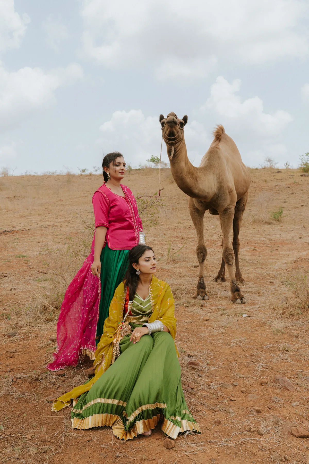
A portrait concept can begin with colour rather than a dramatic pose. One strong clothing colour, a quieter background and a small supporting detail can give a sequence a recognisable mood. The challenge is keeping the person visible within that palette. A colour-led shoot should still contain expression and useful portraits, not only photographs of an outfit against a matching wall. Choose what the colour is meant to do, then let the photographer adapt the idea to the available setting and light.
Planning a session? Explore our portrait photography service alongside this guide.
Give the palette a clear purpose
You might want a warm, intimate feeling, a bold editorial look or a calm series with restrained contrast. Describe that intention before choosing exact shades. A reference colour does not behave identically on every fabric or under every light. The photographer needs to understand the role of the palette so it can be adapted. If the purpose is simply to wear a favourite outfit confidently, that is enough. The concept does not need an invented symbolic explanation to justify its colours.
Choose one main colour
Start with the item that will carry the strongest colour: clothing, a background or a permitted object. Let the other choices support it. Several equally bright elements can divide attention and make the person harder to see. A main colour does not mean everything must match. A quieter neutral or a controlled contrasting detail can keep the image readable. Review the whole arrangement together. A successful clothing choice in isolation may work differently once the background enters the frame.
Test the palette with a simple photograph
Put the outfit beside a picture or sample of the intended background and make a rough phone image. The test will not predict the finished edit, but it can reveal whether the colours compete or disappear into one another. Look at the picture at ordinary viewing size. Can you still identify the face and the shape of the clothing easily? If not, adjust one element before the shoot. Small practical tests are more useful than collecting many references with different colour systems.
Leave room for the person’s expression
A palette is a visual starting point, not a requirement to hold a fashionable blank expression. Explain whether you want a quiet portrait, a confident direct look or more natural variation. The photographer can change framing and direction while keeping the colours consistent. A close portrait may contain less of the main colour but still belong to the sequence. Do not reject it simply because the outfit occupies less space. The person should remain the reason the photograph exists.
Use the background selectively
A coloured setting can dominate a wide frame and become a small accent in a closer one. Plan both uses if you want variety. The photographer may choose an angle that removes an unwanted second colour or simplifies a distracting object. Check permission before changing a location or placing a backdrop. A clean wall can be enough for one setup. You do not need to decorate an entire room to create a coherent series when only a controlled part appears in the image.
Discuss colour expectations realistically
The look of fabric and surroundings can change with lighting and editing. Explain any colour that needs particular care, especially if the images have a business use. For a personal portrait, describe the overall preference rather than demanding that every screen display an identical shade. Ask about the photographer’s editing approach and select a suitable reference. Do not assume a saturated concept requires every colour to be intensified. A restrained edit can preserve the main colour while leaving skin and other details natural.
An illustrative palette plan
Imagine a portrait centred on a deep red outfit against a quieter neutral setting. Begin with a wider picture that shows the garment’s shape. Make a closer portrait where the face leads and the red remains a supporting detail. Add one ordinary seated variation using the same background. This is an illustrative planning example, not a client story. The visual connection comes from a consistent colour choice while the framing and expression give each image a different role.
Avoid adding props without a job
An object may match the palette but still make the photograph busier. Ask what it contributes. Does it explain a personal connection, create a useful shape or simply fill an empty hand? If the answer is unclear, make a version without it. A colour-led concept often becomes stronger when fewer elements compete. You can try an optional detail after the main portraits are covered, but it should not become a reason to delay the useful pictures.
Select a sequence rather than one repeated composition
Choose photographs with different distances and expressions that still feel connected. A wider portrait, a closer face and a detail of fabric can form a small story. Avoid selecting several frames solely because their colours match exactly. The final collection needs a person, a setting and enough variety to remain interesting. If you plan prints, ask about a suitable file and review the palette in that context rather than judging everything from the brightest phone screen.
Bring the palette to the portrait or fashion photography service page with an outfit image and a brief description of the feeling. The photographer can help turn that choice into a practical sequence. One deliberate colour, given enough space, can make a coherent collection without requiring an elaborate production.
Discuss your photography brief
Share your intended use and priorities through our portrait photography service page. Fine Art Photography is based in Diu; travel assignments, coverage, editing and delivery are confirmed individually. Bring the decisions from this guide to the conversation so the proposed session can reflect what you need.
Discuss your photography brief