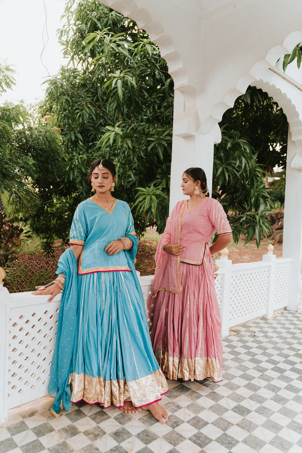
Negative space is the quieter area around a subject. In a portrait, it can make a person feel small within a setting, give an expression room to settle or leave useful space for a design. It is not simply an empty part of the frame that was forgotten. The choice should have a purpose. Tell the photographer whether you want a calm personal portrait, a wider environmental image or a photograph that will carry text later. That purpose determines how much space helps and where it belongs.
Planning a session? Explore our portrait photography service alongside this guide.
Decide what the space should communicate
A person beside a broad quiet wall can feel very different from the same person in a close portrait. The wider frame may suggest solitude, scale or a more graphic composition. Explain the feeling you want without assuming that more empty area always makes the photograph more artistic. If the portrait is meant to show a close relationship, too much distance may weaken that connection. The photographer can use space in different amounts across a sequence rather than applying one formula to every image.
Choose a background that is genuinely quiet
An area can look empty while still containing distracting lines, marks or bright objects. Review the background from the camera’s actual position. The photographer may simplify it through angle and framing rather than removing everything physically. A sky, wall or shaded surface can provide space, but each has its own visual character. Check access and permission before using the setting. The simplest background is the one that supports the picture without requiring complicated changes onsite.
Keep the subject readable
A very wide frame can make the person difficult to recognise, particularly on a phone. Decide whether the image is intended for a large print or a small digital use. The photographer can make a wider conceptual picture and a closer alternative. The person’s posture and outline should remain clear even when facial detail is smaller. Do not expect a crop to recover information that was never prominent in the frame. Plan the balance between setting and identity during the shoot.
Use direction and gaze thoughtfully
Where the person looks can change how the surrounding space feels. Looking into the quieter area may connect them to it; looking towards the camera can create a more direct portrait within the same composition. Neither is automatically better. Try the direction that fits the idea and allow a natural expression. Avoid asking someone to stare dramatically into space if that feels unlike them. A simple, settled posture can make the composition readable without turning the person into a graphic symbol.
Plan text space separately when needed
If the image will be used on a website banner or invitation, tell the photographer where text should sit. A visually quiet area can still be unsuitable if the layout places words across the face. Share the approximate format and any fixed placement. The photographer can leave usable room in the right part of the frame. This is a practical design requirement, not the same as an artistic preference for emptiness. Make both needs clear if the image is expected to do both jobs.
Build variety with distance and scale
Start with the main wide composition, then make a closer portrait and a small detail if they fit the concept. The quieter background can connect them without requiring every frame to include the same amount of space. A sequence often becomes more personal when it moves between the person and their surroundings. Explain which image matters most. If time is short, the photographer can preserve that priority rather than repeatedly adjusting a wide frame at the expense of the closer pictures you also want.
An illustrative quiet-wall sequence
Imagine a portrait intended as both a personal print and a simple website image. The main photograph places the person beside a quiet wall with room for the agreed text area. A second image comes closer for a recognisable portrait, and a third uses a different gaze within the same setting. This is an illustrative planning example, not a client account. The space has a defined role while the person remains the subject across the collection.
Be selective about cropping later
Removing the negative space can change the photograph’s meaning. A crop that turns a wide portrait into a close headshot may lose the relationship with the setting. Choose an image composed for the closer use where possible. If you need an alternative crop, discuss it with the photographer. Keep the original version as well so the wider intention remains available. Different uses can have different files; one photograph does not need to serve every format equally well.
Review at the intended display size
Look at the image where it will actually appear. On a small screen, check that the subject is easy to find. For a print, consider the size and the distance from which it will be viewed. The quieter area should feel deliberate rather than like unused room. Ask whether the picture still has the mood you wanted when reduced or enlarged. A useful negative-space portrait balances a clear subject with enough surrounding room to support the idea.
Use the portrait or personal-branding photography service page to share the intended use and the kind of space you want. A short brief about scale, background and text placement lets the photographer turn a simple composition into an image with a clear purpose.
Discuss your photography brief
Share your intended use and priorities through our portrait photography service page. Fine Art Photography is based in Diu; travel assignments, coverage, editing and delivery are confirmed individually. Bring the decisions from this guide to the conversation so the proposed session can reflect what you need.
Discuss your photography brief