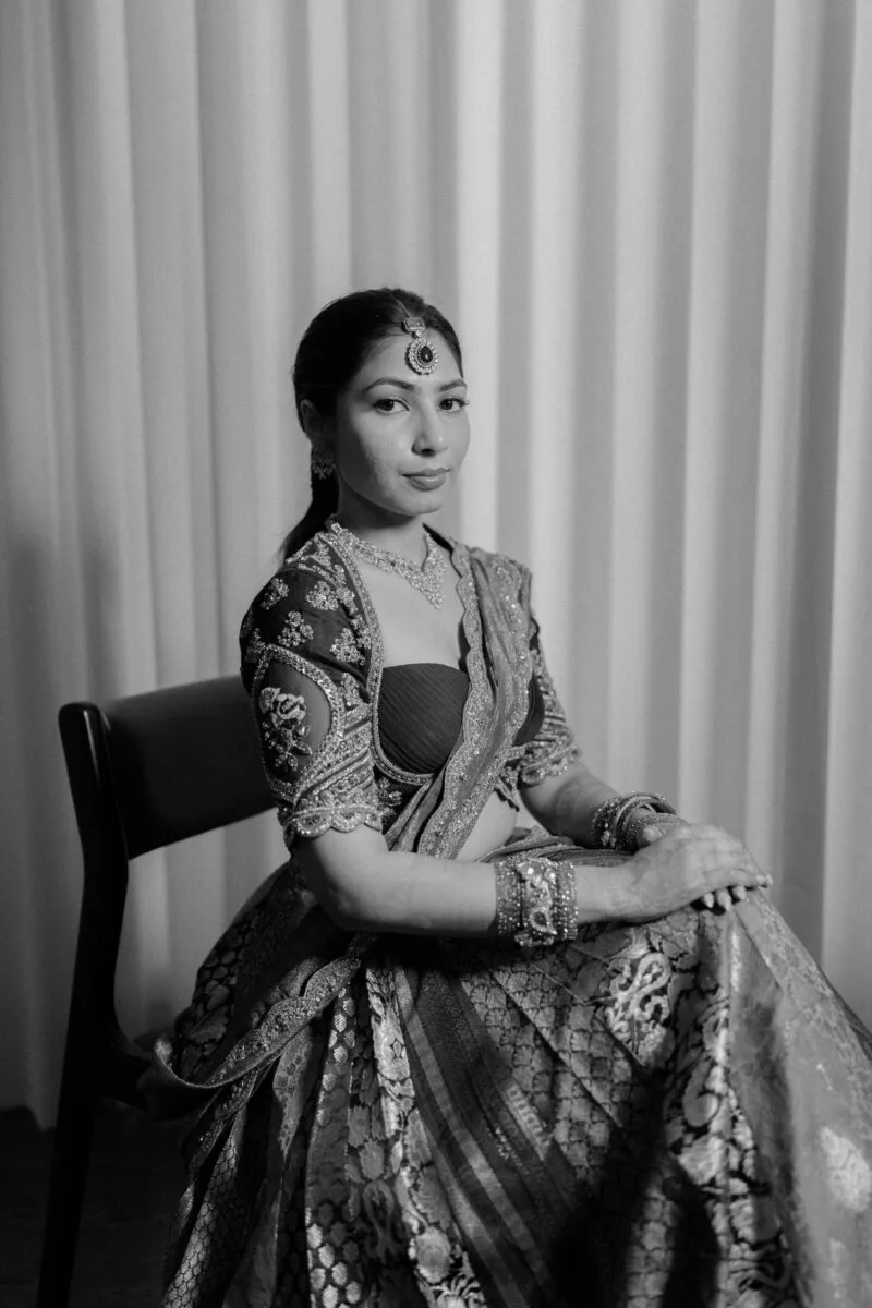
A print proof is a chance to review a photograph as a physical object. On a bright phone screen, colours, edges and small details can look different from the version you place in a room. The most useful review is specific: this image, this size, this paper and this crop. It does not require finding faults in every face. It requires checking whether the photograph and the proposed presentation work together before approving the final production.
Planning a session? Explore our portrait photography service alongside this guide.
Confirm what the proof represents
Ask whether the sample is a full-size proof, a smaller test or a digital layout. A small paper sample can help you discuss colour and surface, but it does not show every detail at the final scale. A digital layout can show placement without confirming the appearance of the chosen paper. Knowing what the proof can answer keeps feedback useful. Request a clear explanation from the photographer or print supplier before treating a sample as a promise about the finished object.
Review the crop before the colour
Start with the boundary of the picture. Check that hands, clothing details and important background elements have not been cut in an unintended way. Consider whether the chosen frame or mount will cover part of the image. A crop that looks comfortable on screen may feel tight once the photograph sits behind an opening. If an edge is uncertain, ask for the proposed visible area to be shown clearly. Settle that boundary before discussing smaller appearance changes.
Look from a realistic viewing distance
A wall photograph and a small album print are used differently. View a wall proof from approximately the distance at which you expect to enjoy it, then move closer for a practical detail check. An album image will naturally be read at close range. Do not judge every large photograph only with your face beside the paper. Equally, do not ignore an obvious distraction simply because it disappears when you stand far away. Both views answer different questions.
Use ordinary, consistent room light
Review the proof in a reasonably consistent setting rather than moving between coloured decorative lights and a phone torch. Tell the supplier where the finished photograph will be displayed if the room has a distinctive lighting situation. Avoid assuming the picture should match a phone with brightness turned up. A screen creates light, while a print is viewed by reflected light. If you are unsure about the comparison, ask the supplier to explain how they assess the output.
Describe colour concerns precisely
“Something looks wrong” is difficult to act on. “The jacket looks more blue than I remember,” or, “The skin looks noticeably warmer than the agreed edit,” gives the team a useful starting point. Refer to the exact image identifier and the area you mean. Ask what can be adjusted before requesting a completely different style. A proof review should preserve the intended character of the photograph while resolving a specific concern, rather than turning every picture into a new editing experiment.
Check important small details without overcorrecting
Look at the details that matter for this photograph: eyes, a valued piece of jewellery, embroidery or a written sign. Ask whether the proposed size makes them readable enough for the purpose. A soft background can be part of the picture, so it need not become sharp simply because you are inspecting a print. Focus your feedback on the subject and intended use. Overcorrecting every texture can change the appearance of a person or the atmosphere you originally liked.
An illustrative proof review
Imagine a portrait intended for a living-room frame. The first proof shows a pleasing expression, but a decorative sleeve touches the visible edge. Before asking for brighter colours, the client and supplier review a slightly wider crop and the mount opening. Once that is settled, they compare the agreed edit on the same paper. This example shows an order of decisions. It is not a client story, and the available adjustments depend on the original photograph and the supplier's process.
Keep feedback in one approved version
If several people are commenting, nominate one person to consolidate the final notes. Contradictory requests about warmth, contrast or crop can create unnecessary rounds. Label the proof version and record what has been approved. If the supplier makes a revision, check the changed area and the overall picture together. Do not assume that agreeing to a crop also approves a different paper or finish. Keep the production choices visible in the final confirmation.
Approve the object, not just the image
Your final check should include the photograph, size, orientation, paper or material, visible crop and any mounting instructions. Confirm the arrangement directly with the supplier. If the display space has a strong colour or a narrow opening, mention it early. A careful proof review gives you a clearer decision and makes communication easier. It cannot make every room's light identical, but it can resolve the practical choices you control before the print is made.
Use the portrait photography service page to explain any planned framed or printed use before your session. Ask about image selection and preparation for printing, and confirm which production services are included or arranged separately. That conversation helps the photographs and their eventual presentation support the same purpose.
Discuss your photography brief
Share your intended use and priorities through our portrait photography service page. Fine Art Photography is based in Diu; travel assignments, coverage, editing and delivery are confirmed individually. Bring the decisions from this guide to the conversation so the proposed session can reflect what you need.
Discuss your photography brief